


“I loved the methods used to teach handwriting so much that I've begun using Rhythm of Handwriting to teach my 2nd grader cursive alongside my kindergartner. She tells me frequently how much easier learning cursive is now that we use ROH. This program has given all of us the confidence to grow in reading and writing!”

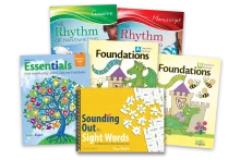
Everything you need to teach manuscript or cursive with success
Rhythm of Handwriting helps students develop the muscle memory of how to form each letter and deepens their knowledge of the connection between letters and sounds.
Begin With Either Cursive or Manuscript.
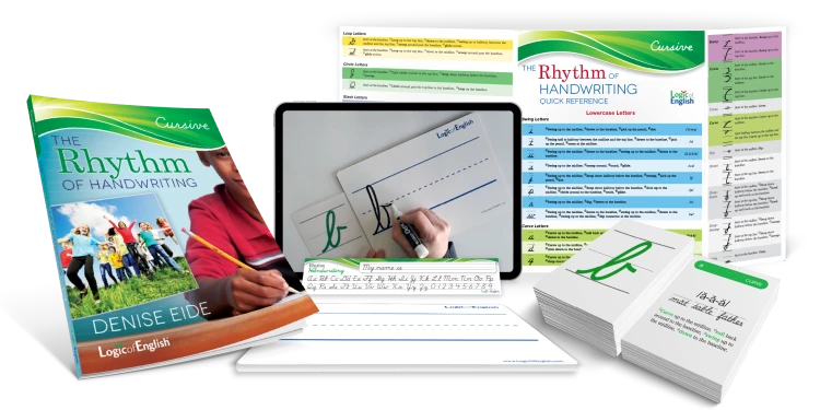
Cursive
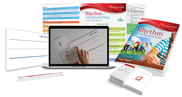
Manuscript
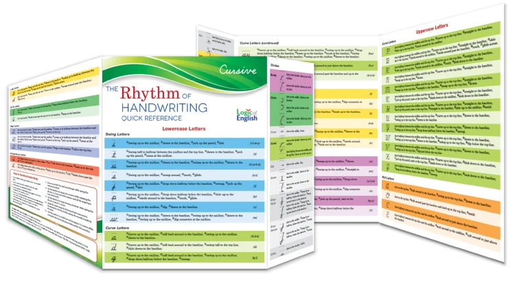
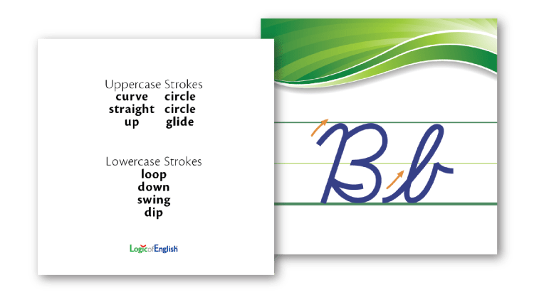
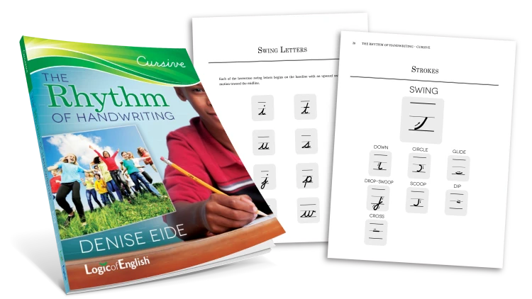
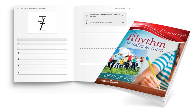
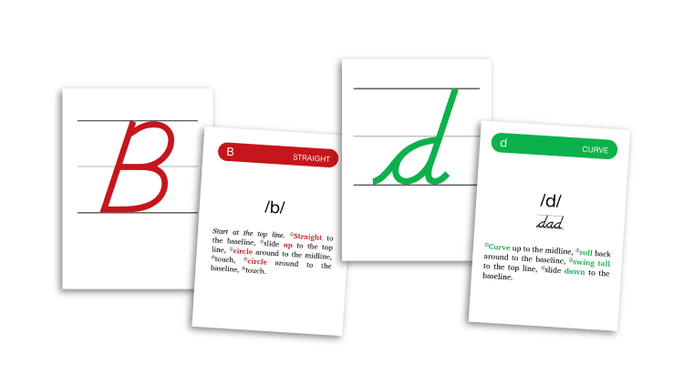
Systematic instruction provided for every stroke needed to form letters and how those strokes are combined.
Systematic instructions for teaching how to form letters and how those strokes are combined
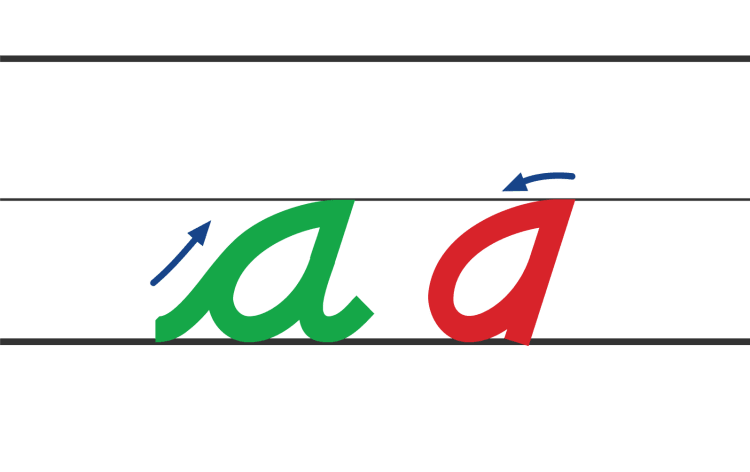
All lowercase letters begin on the baseline.
Most lowercase letters start on the top line or midline to minimize the number of starting places.
Letters are formed with minimal fine-motor skills and lifting of the pencil.
Students are instructed where to place the pencil to begin each letter.
Prevents reversals of letters such as b and d, p and q
Explicit, multimodal instruction helps to minimize reversals.
Since letters are connected, letter spacing is quickly mastered.
Clear directions and systematic practice help students master letter and word spacing.
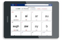
Supplemental Video Instruction

Simplify Your Lesson Plan By Adding ROH Online Supplement
Create a flexible learning environment for you and your students! These digital supplements are designed to ease your lesson planning and promote engaging, independent practice for your students. ROH Online Supplements are perfect for delivering, reviewing and reinforcing instruction.
Explicit Instruction
Easy, systematic instructions provide students with an understanding of how to write each letter and where it is placed on the lines.
Rhythm and Simplicity
Emphasize the rhythmic motions with short, memorable phrases for how to form each letter.
Large-Motor Movements
Teach how to form each letter with large-motor movements before advancing to writing with a pencil.
Logical Order
Letters are grouped by initial strokes to simplify the learning process and encourage the development of automatic muscle memory.
Writing for All
Each lesson includes a variety of line sizes so that students can use the size that is most comfortable for their hands.
Systematic Phonics
Support the development of reading and writing skills by reinforcing the sounds of the A-Z phonograms.
Begin With Lowercase
By introducing lowercase letters first, students master the letters that comprise more than 90% of all that we read and write. This also minimizes students mixing upper- and lowercase within words.

Discover how to teach your students to develop beautiful, consistent handwriting!
Free Handwriting Tips